[Baidu Institute of Front-End Technology] (https://github.com/baidu-ife/ife) (Baidu Institute of Front-End Technology, referred to as IFE) is a front-end training organization for college students jointly produced by Baidu EFE team and Baidu Human Resources Department Campus Recruitment Group. It uses Baidu’s large number of outstanding front-end engineers and rich accumulation of front-end knowledge to help college students learn Web front-end technology more efficiently and systematically.
Baidu Web Front-end Technology Academy has officially opened. I am fortunate to be a student in the first junior class and can play with Chicory.
If you want to study together but are not admitted, you can join the group: 438966405
TASK 0001 is released. The deadline for review submission is April 23 for beginner classes and April 16 for intermediate classes.
TASK 0001 content: https://github.com/baidu-ife/ife/tree/master/task/task0001 (It also sets up sections 1-6 to take care of weaklings like me, thumbs up~)
What I did: https://github.com/DIYgod/ife-work/tree/master/task0001
Online Demo: https://www.anotherhome.net/file/ife/task0001/
This task took a total of 6 days (4.13-4.19)
Below are some records of my work on TASK 0001.
1. position attribute (refer to CSS positioning-W3School, absolute and relative in CSS+DIV layout)
The position attribute is more important, but I didn’t understand it clearly when I looked at it. I just skipped it carelessly, so I had an inexplicable problem when I was doing the task. With the help of egg fried rice, I found out that it was because I didn’t understand the position attribute.
To summarize briefly in your own words: the position attribute has four attribute values: static relative absolute fixed. static is the default, and the element box is generated normally and appears in normal flow; relative makes the element box offset a certain distance, and the original space occupied is still retained, and also appears in normal flow; absolute makes the element box jump out of normal flow, completely deleted, and positioned relative to its containing block, and the original occupied space disappears; fixed also makes the element box jump out of normal flow, and is positioned relative to the browser window.
2. The position where floating elements and subsequent non-floating elements are filled (refer to CSS float floating attribute)
The situation at that time was this: HTML part:
CSS part:
#div6 {
    margin-bottom: 10px;
}
.div6-a {
    float: left;
    width: 50px;
    height: 50px;
    background: #f00;
}
.div6-b {
    margin: 0 50px;
    height: 50px;
    background: #00f;
}
.div6-c {
    float: right;
    width: 50px;
    height: 50px;
    background: #ff0;
}
The result is a problem:
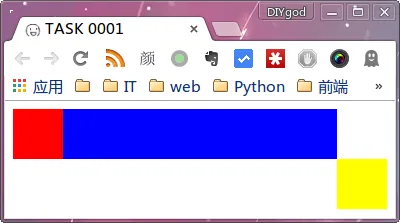
The yellow C element has moved to the next line
I tried to flow the C element to the right first and then fill in the B element, that is:
HTML part:
Achieve expected results:
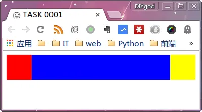
Reason: Floating elements are filled in by subsequent (non-floating) elements in the vacated position of the document flow: block-level elements are filled directly. If they overlap with the range of floating elements, floating elements cover block-level elements; inline elements are inserted if there is a gap.
Therefore, when the C element is added and then the B element is added, the B element is directly filled in the same row of the A and C elements; when the B element is added and then the C element is added, since there is no gap in the row of the B element, the C element floats to the next row.
3. Negative margin (refer to CSS Layout Tips - Powerful Negative Margin)
Holy Grail Layout, Double Flying Wing Layout both use the principle of the influence of negative margins on floating elements. Although an element is written at the back, it can be displayed in the front through negative margins when the browser displays it. See the reference for details. It is very well written.
4. Clear floats (Refer to The floats we cleared together in those years)
When doing the floating layout question, the red container containing the blue squares was always not displayed. I used F12 to see that the height of the red container had become 0. So I looked at the code of the double-flying layout and found that the double-flying layout set an overflow: hidden attribute on the parent element. I tried adding the overflow: hidden attribute to the red container, and the height magically became adaptive. I didn’t understand it.
After Dan Fried Rice’s guidance, I learned that when the child elements all have the flow attribute, the parent element will have no height, and overflow: hidden has the effect of clearing the float, so adding it will restore the height of the parent (see the reference for the principle of clearing the float of overflow: hidden).
So far, it has taken two days to complete the 1-6 practical exercises. The results can be found at: https://www.anotherhome.net/file/ife/task0001-16/task0001.html
The following is a comprehensive exercise, which seems very difficult. .
5. Positioning of absolute elements (Reference In CSS, why does the parent element of absolute positioning (absolute) must be relatively positioned (relative)? - Zhihu)
When writing the navigation bar in question 7, you need to use absolute positioning, but relative to whom is absolute positioning positioned? I never figured it out before.
The positioning of the absolute element is to trace back the parent element, find the first element that is not static, and use it as the basis for absolute. If none of the parent elements are set (static), the absolute positioning inside is based on body positioning.
So the general approach is to add the position: relative attribute to the parent element you want to use as the base.
6. 4px white space for images (refer to Why does container div insist on being slightly larger than its content? -stackoverflow)
When inserting the top picture, I discovered a very strange problem, as shown in the picture:
Image height 500px
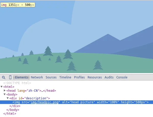
Parent height 504px
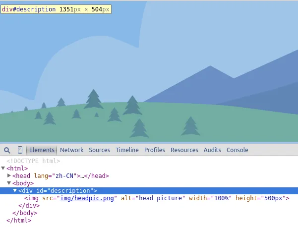
4px more…
After searching online, it is basically the white space that appears due to the setting of [inline-block elements] (http://www.w3cplus.com/css/fighting-the-space-between-inline-block-elements), but I don’t have inline-block elements. But the 4px spacing can be eliminated through a similar method. I solved it by setting the font size of the parent element to 0.
I have simplified the code for the above problem and uploaded it to the server. If you are interested, you can help me take a look: https://www.anotherhome.net/file/ife/task0001-7_problem/
Update: Thank you Saint Winkle, the reason is understood. defaults to an inline element (inline element, inline element), and the default value of line-height (4px) must be added when calculating the height.
From stackoverflow:
Since an
is an inline element by default, it’s height is calculated differently as related to the default line-height value.
On inline elements, the line-height CSS property specifies the height that is used in the calculation of the line box height.
On block level elements, line-height specifies the minimal height of line boxes within the element.
7. CSS controls the height of two DIV columns to be consistent on the left and right (refer to [CSS controls the height of two columns of DIV on the left and right] (http://www.l3c.cn/plus/view.php?aid=8))
Content is the parent element, and multiple posts are child elements. The purpose is to keep the post height consistent.
.content {
    width: 980px;
    overflow: hidden;
}

.post {
    width: 320px;
    float: left;
    margin-bottom: -10000px;
    padding-bottom: 10000px;
    background: #fff;
}
This is how I understand it: by padding-bottom: 10000px, the outer margin and inner margin are increased by 10000px at the same time, and then by margin: -10000px, the inner margin is decreased by 10000px at the same time. Then, when the same height is not reached, the outer margin of the longer element decreases, while the outer margin of the shorter element remains unchanged. After reaching the same height, the outer margins of the longer element and the shorter element decrease at the same time. The results are highly consistent.
8. tr border (refer to How to modify the tr border attribute with CSS)
Setting the border directly to tr in CSS like this does not work, and if you specify the border of td, there will be discontinuity.
tr {
    border: 1px solid #000;
}
If you set the border-collapse attribute for the table at the same time, the border set by tr will appear.
table {
    border-collapse: collapse;
}

tr {
    border: 1px solid #000;
}
See reference for reasons
TASK0001 All completed:
Question 7 Demo: https://www.anotherhome.net/file/ife/task0001/
Questions 1-6 Demo: https://www.anotherhome.net/file/ife/task0001-16/task0001.html
☆ミ(o*・ω・)ノFinished and scattered flowers, waiting for review
At the end of the review, the modifications and summary based on the instructor’s suggestions are as follows:
9. Delete lang=“zh-CN” (Refer to Should the statement in the header of the web page be lang=“zh” or lang=“zh-cn”?)
Modification:
The single zh and zh-CN are both obsolete usages.
After checking Baidu, Taobao, Weibo and other websites, there is no lang attribute written in it, so you can safely delete it.
10. Use h1 tag (Refer to HTML h1 h2 h3 h4 tag knowledge and experience - DIVCSS5)
Modification:
h1 h2 h3 h4 title tags are often used in situations such as the only title, important columns, and important headings in a web page.
Among them, h1 is best used only once in a web page, such as for the unique title of a web page.
You can appropriately use h1 h2 h3 h4 tags in a web page, which will help highlight the key parts of the web page and also help search engine rankings.
I saw that Taobao did the same thing and outsourced an h1 tag to the logo code.
11. Other modifications
I didn’t expect to use class on the a tag and add an extra layer of div:
Naming:
Replace
with border: ”
is not recommended. Use the border of the upper and lower containers instead. When I don’t need this line, I just need to change the style, no need to change the html.”
Use dom with list semantics such as ul li or dl.